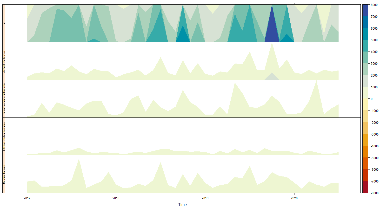
Commonly, line chart is used to show the temporal change of a variable. But, if the value has a large range, it could take a large space for the chart to show the whole change. Horizon chart dissolved the fluctuations in the line charts in several bands and overlap the bands to show the large range of the values in a relative narrow space. It benefit us to compare various variable in a short time.

The data

Either vector data or matrix can be the input of the chart. My original dataset is composed of three columns: mon, frequency, and keyword.

1
2
3
4
5
6
7
8
9
10
11
12
13
library(lattice)
library(latticeExtra)

# read data
paper_all_frequency <- read_csv("C:your_address_of_the_data.csv")
paper_all_frequency$mon = as.Date(paste(paper_all_frequency$mon,"-01",sep=""))
# ranking the origin dataset by time
frequency_ordered = paper_keyword_frequency[order( paper_keyword_frequency$keyword,paper_keyword_frequency$mon),]
# convert the frequency into matrix
paper_frequency = matrix(frequency_ordered$frequency, ncol = 5)
# convert the matrix into the time-series data
# frequency = 12 means the temporal gap is one month
paper_frequency = ts(paper_frequency, start = c(2017, 1), frequency = 12, names = c( "all" , "Artificial intelligence","Human computer interaction","Life and medical sciences","Machine learning"))

Horizon chart

Draw the horizon chart:

1
2
3
4
# draw horizon plot
# nbands indicates the layers of each chart
# horizonscale is the width of each band
horizonplot(paper_frequency, nbands = 8, horizonscale = 150, origin = 0, colorkey = TRUE)

A Horizon Chart


Reference

[1] Horizon Plots
[2] Plotting Horizon Plots
[3] Horizon Plots